Portal Cards
The portal widget Portal Cards displays cards with the redirection links to the specified portal pages. The records data is stored in the Portal cards (portal_card) table. There you can configure access criteria, title, description, image, redirection link, and the order of the cards in the widget.
When updating to platform version 1.28.2, you can migrate existing records of the portal cards from the Node (simple_node) table to the Portal Card (portal_card) table. To do so, follow the steps:
- Navigate to System Settings → Server Scripts.
- Find and open the Portal Card Migration record.
- Click Run.
After the script is executed, the migrated records appear in the Portal Card (portal_card) table. You can review them in the table and configure their display in the Portal Cards widget.
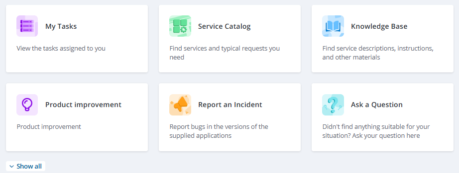
In the "out-of-the-box" solution, the Portal Cards widget is placed on the main page of the portal.
Read more about the page and widget instances creation and their configuration in the Page Structure article.
Configure the widget
To configure the values of the widget options, complete the following steps:
- Ensure that the Simple application is selected in the Admin preferences.
- Navigate to Portal Structure → Widget Instances.
- Create or find the required instance of the Portal Cards widget and open its form.
- Configure the value of the widget options in the Schema option values field. Note that a maximum of three cards can fit in a single row of the widget.
- Click Save or Save and exit.
Available options:
| Name | Type | Description |
|---|---|---|
| isShowImage | Boolean | Set the value to true to display images in the widget card bodies. |
| orientation | String | Specify text and image alignment in the card. Available values:
|
| collapseOptions | Object | Specify how many rows must be displayed by default. If there are more rows than specified, the Hide and Show all buttons appear in the widget.
|
| isShowDescription | Boolean | Set the value to true to display card description. |
| cardsStructure | String | Specify the tree the widget is available for. |
{
   "cardsStructure":"portal",
   "isShowImage": true,
   "orientation": "left",
   "collapseOptions": {
      "mobileCountRow": 3,
      "tabletCountRow": 2,
      "desktopCountRow": 2
      },
   "isShowDescription": true
}
Create cards on the portal
To create a card, complete the following steps:
- Navigate to Portal Structure → Service Portal → Portal Cards.
- Click New and fill in the fields.
- Click Save or Save and exit to apply the changes.
Portal Card form fields
| Field | Mandatory | Description |
|---|---|---|
| Name | Y | Specify the card title. |
| Order | Y | Specify the display order of cards in the widget. By default, the system sets the order equal to The highest order among existing records + 10. |
| Access criteria | N | Specify the records from the User Criteria (sys_user_criteria) tables to grant access to the card for specific users. |
| Description | Y | Add the card description. The description is displayed on the card if the isShowDescription parameter is set to true. |
| Active | Y | Select the checkbox to display the card in the widget. |
| Link | Y | Specify a link to redirect the user after they click the card. The link can be either absolute or relative directing users to the portal pages only. |
| Image | N | Add an image file. All images are automatically resized to 48 × 48 pixels. |
| Tree | Y | Specify the tree that the card is associated with. |